Category Archives: lit

I Hate Sounding Like I’m Using Hyperbole But …

I’m currently reading through Asterios Polyp by David Mazzucchelli and I’m just staggered by how good this is; content, design, layout, color, everything. I’m halfway through and frankly haven’t had this feeling about a book’s contribution to its genre since reading Jimmy Corrigan (sadly, I suspect this will be the go-to comparison in upcoming reviews precisely because  they feel like such strong “statements” despite being worlds apart thematically).

I realize how snobby the above thoughts sound. However, I literally put the book down every five or ten pages, reach for my computer and then decide I need to go back and make sure about what I’m reading. This being the halfway point, I feel confident in stating this book is a product of genius. A pure, precise effort that also has enough nuanced details to reward multiple readings (check the juxtaposition of assumptions of the first few pages with a major turning point later in the book, for instance).

The only other work by Mazzucchelli I’m familiar with is the superb adaptation of Auster’s City of Glass – something I almost taught as part of the Black Cloud curriculum last summer.

We Could Be Self Important

On Saturday, getting lost in the insane crowds at the Los Angeles Times Festival of Books, I attended two panels of fiction writers. The contrast between the two was unsettlingly clear.
In the morning, five female authors discussed their latest YA (Young Adult) novels and the differences between YA and non-YA work:

Growing Up: Young Adult Fiction
Moderator   Ms. Cecil Castellucci
Ms. Robin Benway
Ms. Deb Caletti
Ms. Lauren Myracle
Ms. Lisa Yee

The panel was fun and admittedly “girly.” The authors get paid to represent the day-to-day inner turmoil of coming of age teen girls. The panel talked about how much fun writing YA can be. Mark and I used Cecil Casetllucci’s novel The Plain Janes for our graffiti unit and the students generally really liked it. I think YA lit gets a bad rap; it’s not considered “real” literature but is also the common dominator of what our students are expected to read for leisure. Likewise, looking at the popularity (with adults) of the Twilight series and Harry Potter, I think the no-rules-apply approach of YA has a broad appeal. Frankly, YA is fun to read and feels much more open than those stuffy adult novels most of us hold in front of us at airports and cafes.

Later, in the afternoon, I went to the following session (notice how the Festival offers absolutely no useful descriptions of these sessions?):

Writing from Different Angles
Moderator   Mr. Michael Silverblatt
Mr. Bernard Cooper
Ms. Katherine Dunn
Mr. Geoff Dyer
Mr. Pico Iyer

Aside from the fact that two of my all-time favorite literary works were written by panelists on this stage, I can say that this panel was downright incredible. These superstars in the literary world (or, as Silverblatt joked an awesome fictitious law firm: Dyer, Iyer, Cooper, and Dunn) discussed the blurred distinction between fiction and non-fiction. The discussion went everywhere and my efforts to capture it will not do justice to the intellect displayed.

At the end of the day, I was struck by the way these two panels both catered to passionate readers and yet spoke in languages that couldn’t have been more different. The YA panel was fun. The women speaking were happy to discuss their craft and enjoyed the pleasantry of the YA genre. On the other hand, the masters of literature in the afternoon discussed the serious, intellectual work that is required of literature; this was difficult, important stuff. The gender distinction is striking too (talking with Rhea after the panel, it felt like, though Katherine Dunn is a huge force in contemporary literature, her classic text feels so embraced because it does not feel feminine at all).

And while we spent an hour listening to the distinctions between fiction and non-fiction, I was left thinking about the false distinction between real literature and “the other stuff.” I think there is a lot of merit in the best that YA has to offer. I realize that many high school English departments would challenge me if I merely taught the works of the YA panelists; that the works of Silverblatt’s confidants would be acceptable reading as a literary experience. The limitations found in this distinction seem to hurt the field of literature at large. In the same way that youth culture in the classroom can occasionally be a source of contention, deciding what is “good” literature versus what is one’s “guilty pleasure” is a dangerous path for both readers and writers. What would YA look like if it presented itself more seriously? Likewise, what would happen if literary literature (my new label) lightened up a bit? How would these shifts trickle into our classrooms?

Judging Books By Their Covers (Why We Can’t Get It Right: Book Design Edition)

I’ve written previously about what book size tells us when dealing with education texts. Lately, I’ve had another beef with education books – also probably not a novel one, but one that needs to be shared nonetheless. Obviously the geeky bibliophile in me will lead the way through this post … you’ve been warned.

Look at all of these books:

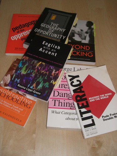
These are all books that have some pretty important, exciting content in them.

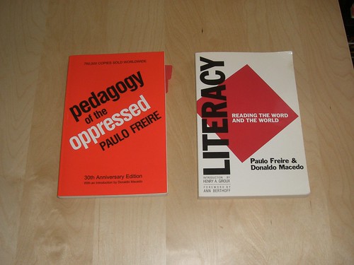
These two in particular have been fundamental in my growth as an educator (I’m sure I’m not alone in this feeling):

However, why, as educators, do we need to settle for texts that – despite the amazing content held within – are designed terribly? Just because a book is “academic” in nature doesn’t mean it has to be an eyesore, right?

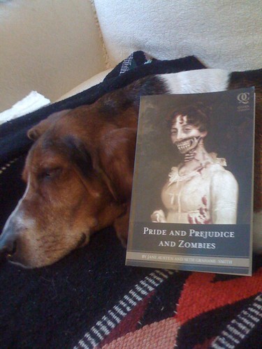
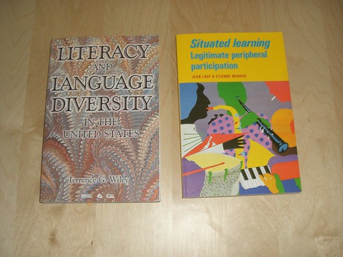
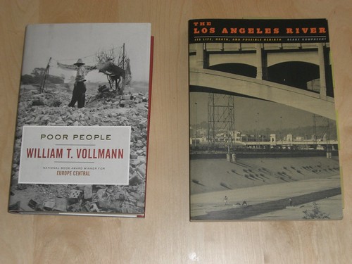
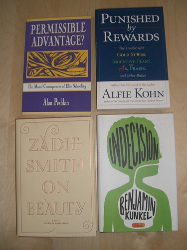
I mean these two books hurt my eyes just to look at them:

I realize that good design isn’t free and so the reliance on generic, quickly designed covers helps keep costs low. (Yeah right, like any of these texts are by any means “cheap”!)

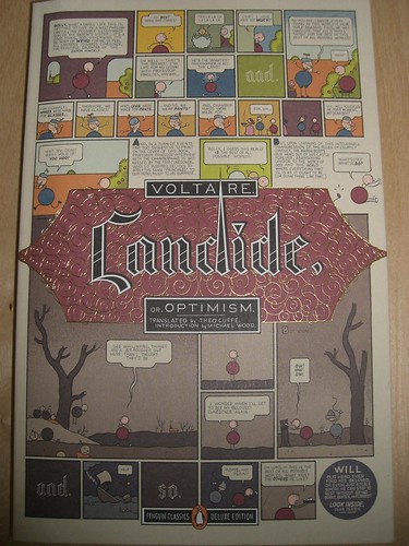
I’m not asking for anything fancy. Not everyone necessarily wants Chris Ware to design their covers. But if you are, I’d start with Candide (this photo does not do this [moderately priced] paperback justice):

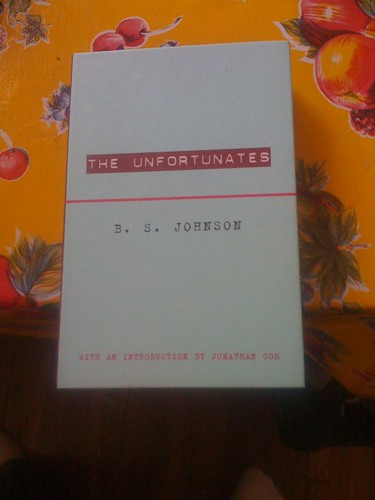
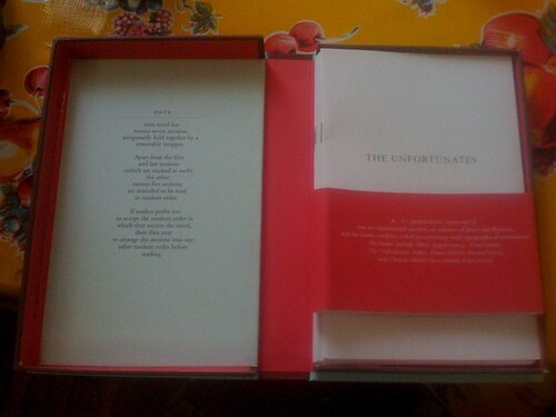
Book design doesn’t have to be fancy. A nice photograph and decently formatted text will make me happy:

Or even a decently designed graphic and text work:

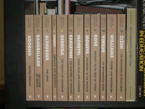
Likewise, if you’re creating a series of books, uniformity can make the texts shine. Here’re a few Murakami books that were sitting on my shelf:

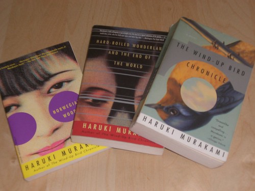
I appreciate the consistency across the texts. It’s easy for me to locate other texts by the author I may be interested in when I’m perusing a bookstore (remember those?). Simialrly, these minimally designed philosophy texts from Verso attest to the less-is-more aesthetic that even Ed. texts could aspire to and still feel “academic.”

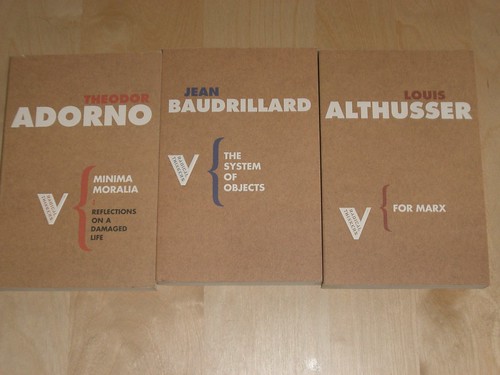
And they look awesome on a bookshelf together (for the record, I’ve only read about half of these so far):

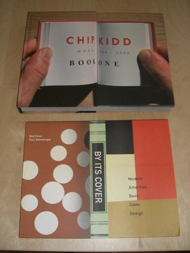
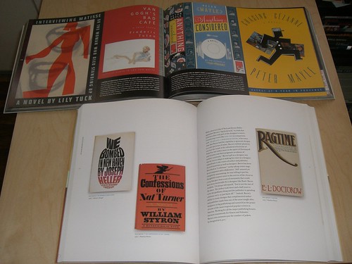
Chip Kidd is basically a book design legend at this point, so it feels odd not to mention him in this post. I guarantee you’ve been drawn to his book covers on countless occasions. A collection of his work as well as a book commemorating Penguin book design always feel inspiring:

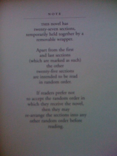
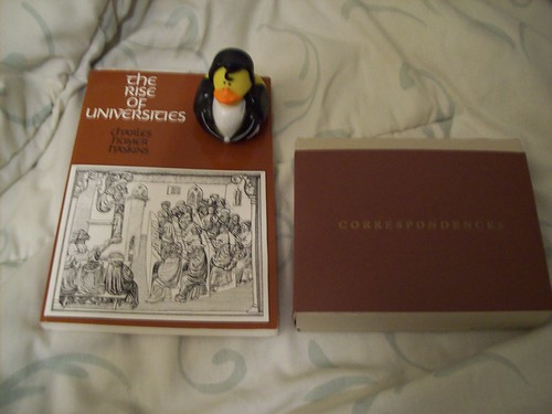
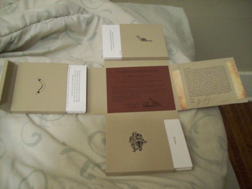
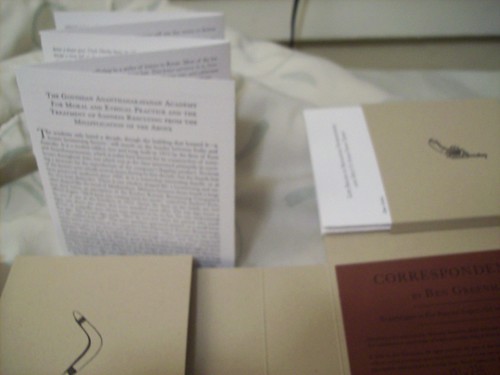
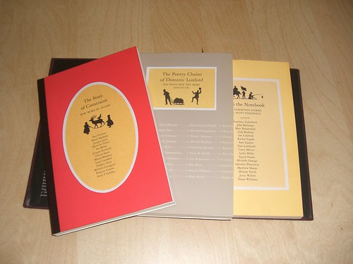
Similarly, I’ve been a fan of the design work being done through McSweeney’s for a while. Consistently, books and periodicals published by McSweeney’s are often beautiful, quirky, and “fun” for readers to interact with. This issue of their periodical was certainly one of the more “normal” issues: three separatly bound collections held within a larger, magnetic casing:

Ultimately, it’s not like most educators are going to stop reading or purchasing educational texts simply because of poor design. However, it feels like we should at least ask for better looking products. And who knows, maybe a non-educator might pick up the text because it looked interesting. Maybe one of my students will be intrigued enough by the beautifully designed book about education. Maybe that will be enough for a student to take a step toward a book that would otherwise look “boring.”

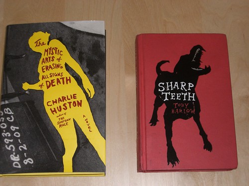
Even simple elegant design could be enough. Which two books here would your eye be most drawn to?

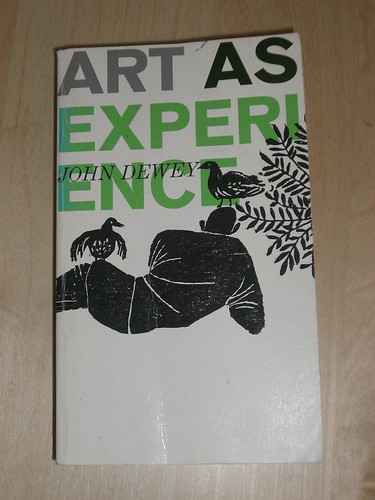
As a final thought, I want to point out the sole education-ish text who’s design I’m intrigued by. While delving into the typical education texts by Dewey, I stumbled across this gem, and the design alone compelled me to pick it up – it has since become a key foundation to my understanding of aesthetic, education, and self.

Thanks Glenn

Glenn Goldman, owner of Book Soup, passed away yesterday. The two years I spent mainly wasting time while on the payroll at Book Soup were fantastic. Although student teaching (and later teaching/completing my Masters), Book Soup was a useful way to get away from the world of secondary education if only for an evening or weekend shift. The newsstand, in particular, was an eye-opening locale to work at. I met some amazing people & read some amazing books while at The Soup and I’m grateful for the opportunity that Glenn gave me (with a call for an interview on Halloween, no less).

Though it’s not exactly the most lucrative of markets, I do hope that Book Soup perseveres.

Books in Boxes: BSRAYDEKWTDWT

I’ll stand rank-in-file with other bibliophiles about the graceful perfection that is a book’s form. It – in its compact design and wealth of stored, permanent (read-only) memory – is a supreme and methuselah-istic technology.

That being said, the playful aspects of experimental literature are provoking in the way they push this form beyond the typical confines of the bound novel. Yes, the plethora of electronic literature is where most people suspect literature to move toward (Hayles’ latest book – both bound and digital –  likely the best source for work on this). However, there’s something to be said for the tangible nature of the occasional experimental text. As such, here are two recent works that I’ve been fascinated by:

The Unfortunates by B. S. Johnson arrives in a box, though it looks unremarkable on the shelf (the side of the box acting as spine of a “regular” novel). However, upon opening the “book” the contents and their instructions are revealed:

[Note: This novel has twenty-seven sections, temporarily held together by a removable wrapper. Apart from the first and last sections (which are marked as such) the other twenty-five sections are intended to be read in random order. If readers prefer not to accept the random order in which they receive the novel, then they may re-arrange the sections into any other order before reading.]

After reading Johnson’s novel, I’ll say I was underwhelmed only by the fact that the book did exactly what I hoped it would; I felt like I was thrown into the random, haphazard way that memory unfolds and takes hold. I could empathize with the method but still felt like the story itself was secondary to the experiment. Regardless, there’s a wonderful bio on Johnson that I’ve been plotting to read sooner than later.

On the opposite end of the extreme, Correspondences by Ben Greenman is such a lavishly letter-pressed trinket of a box that I fret doing the kind of serious reading that has crippled many a text that has come across my path.

Correspondences next to Greaser Duck and another book for size comparison.

Apparently limited (mine being numbered 151 of 250), Correspondences includes several stories printed on the text as well as folded on pamphlets. Unlike Johnson’s text, Greenman’s makes you aware of the object as you relate to its contents. I think this combination is what I find as a portal toward more organic experimental literature (I think, for instance, of the way House of Leaves, by the simple dimensions of its cover is literally a text that does not fit within the bound book – a realization you make by holding the paperback).

And while it sounds like future editions of Correspondences will be printed (likely in a more traditional form), that version’s text is in our hands (figuratively … and maybe literally). The story “What He’s Poised To Do” is an incomplete text. A series of postcards help build the links between the elements of Greenman’s text. However, these postcards need to still be written … by us! Though the Correspondences box comes with its own sample postcards, we are invited to add to the fiction that Greenman has started. I’m interested in using this in my classroom. Maybe Greenman has a few collaborators? Maybe one of them is you?

Yes, I realize that McSweeney’s has done several issues of their Quarterly in boxes and other shapes, including something along the lines of the way Johnson incorporates chance into his work. However, I feel the above two texts are exemplary. There’s a feeling of commitment by the author when presented with an entire work by an author in an otherwise unusual form. Worthwhile additions to the growing shelf of BSRAYDEKWTDWT.

Last Thoughts on ‘08

I was going to do a top ten kind of list for the year but realized that most of the things listed would be obvious. As such, I’ll offer a few words on my year in reading and listening – a self-indulgent activity afforded by an already self-indulgent blog.

There really couldn’t have been a book atop my list that wasn’t Infinite Jest. I can’t remember spending as long as I did reading a book in the past. A surreal year to read the book, the loss of DFW framed the last third of the book in a more profound, vivid lens through which to read the reflections on depression.

I’ll also add that the graphic novel Robot Dreams, though wordless and typically advertised for elementary and middle-school aged children was still one of the other books that made a big impression on me. Following along with the election politics in DMZ was also a timely highlight throughout the year and the expected conclusion of Ex Machina this year will be the anticipated comic highlight.

Lastly, as far as music for ’08 goes the likely suspects would have rounded out any list I’d have made: the Walkmen, Jon Brion’s score for Synecdoche, New York, and that Lil Wayne album (no, not proud of this one) were played on a constant basis. However, perhaps the unsung hero of my ’08 listening habits is Future Islands: although the band made less than a blip in the press, their album, Wave Like Home is the sea shanty anthem that I whole heatedly blast during my commute between the opposing shores of Manual Arts and the doctoral program. I also became a big proponent of all things King Khan and BBQ and continued purchasing way more Acid Mothers Temple and tropicalia CDs than I could possibly have room for. Still waiting for the Tropical Revolution to take hold here in Los Angeles. As far as ’09 is concerned, the forthcoming Animal Collective album is by far one of the best things I’d heard all year.

Next year should be a good one: I’ve decided to participate in “National Reading 2666 Month” (I actually started the first volume while in the Bay, but probably won’t finish the final volume until Winter Quarter is over). There will be a new Geoff Dyer book, a new text by Sir Ken Robinson due any day now, an Ishiguro collection, and more than enough grad school texts to get in the way of otherwise leisure reading.

“An Alchemical Transformation”: J.S.G. Boggs and the Convergence of Art and Money and Pedagogy

The reason you need to read Boggs: A Comedy of Values is because it changes the way you see the world. That’s as simply as I can put it. It’s not a new book. It’s a slight tome, under 150 pages of narrative juice. However, the book and the artist at the heart of the account are too entertaining to simply pass on.

Before jumping into why J. S. G. Boggs matters to you, I should probably say that Lawrence Weschler is one of my favorite non-fiction writers. He’s written about my favorite places in the city and his series of convergences strike at the heart of what the Beyond Pedagogy reading group was striving for. Weschler knows how to tell an entertaining story, even if it is occasionally a cerebral one. When I think favorably about the work in the New Yorker, it’s often that its one of the few mainstream places for long-form journalism to spread its wings; I think of that Professor Seagull account, of the early ‘90s two-parter on surfing with “Doc” in San Francisco, of Trillian’s description of Kenny Shopsin, of the magic that is Ricky Jay, and I think of Weschler’s work at large. As a writer, it was these long pieces that influenced what I wanted to write and how I wanted to approach a story. I also realized that my limitations in terms of patience and – frankly – skill in execution meant that such efforts should be largely left to more focused scribes. Nevertheless, sometimes while listening to the manic squabble of Cliff “Ukulele Ike” Edwards, or maybe witnessing the frantic scratches for sound at one of the infinite Jon Brion shows I’ve attended, I imagine great unfolding profiles about looming personalities I hope to read (or, as Zappa said, “He not only dreams imaginary guitar notes, but, to make matters worse, dreams imaginary vocal parts to a song about the imaginary journalistic profession”).

With that out of the way, here’s what you should know about Boggs: he’s an artist. Mainly, he creates drawings and paintings of and about money. As a result, he’s been arrested and involved in numerous lawsuits for counterfeiting currency: U.S. currency, British pounds, Australian notes.

Actually, these drawings aren’t even what Boggs considers his art. Instead, he’ll take a drawing of, say, a ten-dollar note (of course only drawn on one side of paper) and attempt to “spend it.” For instance, he might take it to a restaurant and see if his meal can be bought with the ten-dollar picture. In exchange, Boggs expects a receipt and any change left from the transaction (an $8.45 meal would require the person involved in the exchange to actually pay Boggs $1.55). This transaction and its verifying documents is Boggs’ art. In the art market such Boggs paintings often go for thousands of dollars, but Boggs prefers making these transactions with people that aren’t familiar with his reputation.

Reading about this process was thrilling. I started thinking about long-term implications this can have on classroom practice, on replication and authenticity, on the palimpsest-ual allure of spending images of those things that are to be spent (palimpsest being a word I’ve been returning to in my thinking of late). I’m still thinking through these ideas and cannot offer any new insights, but Weschler offers a useful entry point:

Boggs had almost accidentally stumbled upon the terrain but then decided to pitch his tent there along the fault line where art and money abut and overlap – and his current work has definite ramifications in both directions. The questions it raises start out as small perturbations: How is this drawing different from its model (this bill)? Would you accept it in lieu of this bill? If so, why? If not, why not? But they quickly expand (as you think about them, as you savor them) into true temblors: What is art? What is money? What is the one worth, and what the other? What is worth worth? How does value itself arise, and live, and gutter out?

Later in one of the book’s closing sections, Weschler describes one of Boggs more ambitious extensions of his conceptual art. This too allows me to consider the role of participation and teacher-learners in a Freirean frame. It’s all too tempting, I suspect, to write off what Boggs is doing as purely theoretical or art-practice only. I am, however, now reviewing the education terrain in my class because of silly thumbprints and five-dollar notes in the Boggs-o-verse:

… Boggs informed me one afternoon toward the end of 1992, he’d decided to raise the ante considerably. He was about to embark on what he was calling “Project Pittsburgh.” He had fashioned an entirely new edition of Boggs bills – brand-new drawings in denominations ranging from one, five, ten, and twenty dollars on up through ten thousand. He’d laser printed a million dollars “worth” of these bills – enough to fill a bulging suitcase. Starting on January 1, 1993, … he was going to try to spend these bills in his usual fashion, by getting people to accept them knowingly in exchange for goods and services; only this time he’d be adding a new twist: he was going to encourage anyone who accepted his bills to keep them in circulation. This time, he was using the back side of the bills as well: an elaborate lacework design filigreed around five empty circles. Anyone accepting a bill was to immediately press his or her thumbprint into one of the empty circles (“just like being arrested,” Boggs noted, with evident satisfaction), and the bill would not be deemed to have completed its life cycle until it had changed hands five times, acquiring a full complement of thumbprints. “I want others to share in the fascinating experience of trying to get people to accept art as face value,” Boggs said, which expansive generosity. “And I, in turn, want to share in my collectors’ experiences of trying to track these pieces down.” Be that as it may, the practical consequence of Boggs’ experiment was that he was going to be creating five million dollars of value out of nothing – an alchemical transformation likely to provoke the Internal Revenue Service every bit as much as the Secret Service. (Boggs assured me that he stood ready as always to cut the IRS its own fair share of Boggs notes.)

As much as I feel inept about art and the art world, I’d be interested in applying these philosophical constraints to an educational cohort. From experiences during the Black Cloud game, it’s clear that the in-roads that art clears toward learning are ones that students access differently than what paths may be taken in traditional English classes. More than anything, projects like Boggs’ are about the individual’s experience. About being un-situated (in some sort of corollary to Lave and Wenger)and building a re-situated understanding of the world around you.

“I dreamt of detectives lost in the dark city.”

I am quoted in this Edutopia article about the Internet, classroom barriers, and how I’ve gotten around them.

Aside from horn-tooting purposes, I think the article offers some practical solutions to the tech challenge many of us face. It’s another step in the direction of my push for a pro-cell phone classroom.

If you’re stumbling across this site from the aforementioned article, or you’re just wondering what’s going on around here, this blog took a turn toward higher ed for a sec. However, after a brief visit to the Thunderdome, I’ll be back to scrutinizing Manual. Most appropriate would be a look at the current regime change that’s underway.

Lastly, this seems to be a terrible time for me to be immersed in graduate studies. The past few days I’ve been culling through a mass of new books I have no time to read. Highlights include the complete correspondance between Elizabeth Bishop and Robert Lowell and a collection of Roberto Bolano’s poetry (hence the post’s title). I anticipate sinking into Bolano overdrive soon as well.

“New Ways of Living”


Look, I get it. Most of you aren’t comic book readers. It’s a genre still too stigmatized to be really acknowledged or embraced by most. Though I think we’ll all talk about the medium’s merits when it comes to youth literacy, I think any discussion of comics will end there. And as much as you may not be interested in them, there’s one we need to spend some time looking at. It’s a collection of manga (gasp). It’s called New Engineering.

Yuichi Yokoyama doesn’t draft narratives or tell stories in any traditional sense. Each story is a basic exploration of a specific theme or motif. Take the collection’s first story, “Book,” for instance [image above]: over the course of 18 pages, Yokoyama provides a near wordless fight that takes place in a library. No explanation of the source of conflict. No descriptions of protagonists or antagonists. Nothing but the essence of a fight. However, as the pages go by, it becomes clear that Yokoyma is establishing a clear grammar for how action is expressed. The text is difficult. Sure, there are only sound effects as far as actual words (these being translated at the bottom of the page beautifully: “BIRA BIRA BIRA sound of paper falling” or “DOSU DOSU sound of swords going into tatami mat”), but the reading of the story took me far longer than other comic books, graphic novels, etc. Seriously, this book of almost no text has a huge importance on my understanding of literacy. A great analysis of the fighting sequences in the collection can be found here.

More thrilling are the four Engineering stories included in the collection. Again a simple premise: people building stuff. However each page shows an entire world or ecology being constructed. First a machine rolling down extreme rock shards, or flooding an area, or building a huge pile of blocks. Next, individuals insert trees or roll out a huge tarmac of earth, or paint the details of a river, or who knows what. Being involved understanding the logic within each Engineering endeavor is thrilling. Where are these being built? What is the purpose? I am reminded of Zoom for no particular reason.

At the end of this collection, Yokoyama provides a sparse commentary for each story. These too only add to the allure of the minimalist yet dense collection:

BOOK
I wanted to explore the appeal of the formal qualities of the book, as an obect made of layers of paper. By throwing books, the protagonist is able to make his escape from assailants, who have their swords drawn. The book overcomes the sword.

Or

ENGINEERING 4
In a barren area in the middle of noweher, spring water begins flowing, and eventually becomes a river. Only the sound of construction and water are audible in this uninhabited land.

Or

WHEEL
People riding spinning wheels are falling form a building. There is a flower garden on the roof of the building. The buildings in this area seem to be built either on moats or on water.

Notice in this last one the emphasis on “seem.” I’m thrilled by this uncertainty. Often times I’m not entirely sure what is happening in a given panel or even whole series of pages. There’s a dream-like quality that nestles in these pages.

When I wrote more about music, in the past, I was usually drawn to the kinds of artists that created genres and lyrics and compositions that inhabited their own spaces. Tom Waits never ventures far out of a world of tin cans and calliopes that is truly his own. Likewise, Robyn Hitchcock is constantly identifying the taxonomy and politics of a world of fungus and vegetables and idyllic perversion. Deerhoof dabble in a form of pop music that is all too much their own. And can someone please explain Cliff Edwards to me? Amazing. In any case, Yokoyama illustrates the everyday actions and lifestyles of a world that’s not our own. It’s an intense process that continues to reveal the intricacies of our own lives. As a comic artist, there is no specific commentary or ideology being prescribed beyond the SHURURURURU or MOKU MOKU MOKU of constructed landscapes. But then again, I can’t imagine any other comics that so mordantly succeed at making the “invisible visible.”

Excellent! Looks like there is another Yokoyama book coming out next month.

[note: the images here are cribbed from places on the unreliable world of the ‘nets. Sorry in advance for when they slowly become big red x’s.]